Showing posts with label Technology. Show all posts

Sunday, March 29, 2015

bigdata
In marketing, data is power. Surveys of marketers across industries suggest that brands of all shapes and sizes have hopped on the big data bandwagon. The Direct Marketing Association found that 84 percent of respondents plan to increase spending in data-driven marketing for 2015.
Just the same, an InfoGroup survey found that brands rely on a number of different sources to collect and analyze this data. All of these activities are done in the name of improving customer experience with the type of marketing content and information that compels conversions and appeals to new customers.
Data is important, but it’s not just having all of this information that makes data-driven marketing successful. There are several important steps marketers must take to ensure they reach the outcomes they want within their budgets. Here are four steps any marketer can take to turn data into actionable insights that directly improve customer experience.

Conduct interviews to fill in the gaps

interview 520x533 4 ways to improve customer experience with data
Quantitative data is great to determine which strategies work and where a brand needs to see improvement. However, no statistic can explain why a campaign succeeded better than the customer who made the decision to convert, whether that meant a purchase or a simple request for more information. Reaching out to customers and asking them what drove them to act will provide context to  quantitative metrics.
It’s important to conduct a few interviews from each customer segment using your product, too. What worked for one customer may not have been as effective for another. Understanding data and trends mean collecting information from a sizable sample of your target audience.
When conducting interviews, the goal is to get to know the different user groups. By looking at usage and behavior data in a third-party analytics tool, such as Preact, you can identify specific user groups and analyze the product features used most. If the goal is to improve the overall product, you need information from different categories. Alternately, if the goal is specifically to optimize a certain feature, you can subset user categories.
In both cases, you can send out either a survey via Survey Monkey or Tech Validate, or an email asking if recipients are interested in having a conversation. You’d be surprised how many people want to talk to you, and they often have great feedback and advice about what’s working and what needs improvement.

Examine usage data to assess customer experience

data scientist 520x364 4 ways to improve customer experience with data
Segmentation and personalization are all the rage in Web marketing. Big data helps companies understand different portions of their target audience and identify the best content for that group based on what made similar customers convert. This process can always improve, though. What attracts a young millennial to your product may be different from what attracts a Gen-Xer or Baby Boomer.
Consider who you are trying to attract. Are all of these groups satisfied with their experiences? Are they similarly engaged with your product? The ways different website visitors interacted with certain content and how it moved them through the conversion funnel will highlight what is working and what can improve.
Preact can also track event data, such as how know many times a customer has clicked on a certain button or viewed a page. It collects contact and professional information, which helps to determine customer segments. You can also keep track of formal customer complaints with tools such as Zendesk, which can help uncover bugs quickly via Zendesk tickets.

Identify stagnant customers to bring them back

Talking to your users and customers is a bad idea twoodo1 624x338 520x281 4 ways to improve customer experience with data
Sometimes a strategy doesn’t yield the expected ROI, or it doesn’t keep customers coming back to a brand. When someone converts once or twice but then doesn’t return, there may be an opportunity to capture that customer again with a better understanding of the conversion paths he took.
Again, look at your quantitative data to hypothesize what could be happening, conduct experiments and hold interviews. Once there’s a clear pattern for why these customers aren’t returning, solve the problem in your product, and then reach out to past customers with new information to get them back onboard.
To conduct experiments, consider using Optimizely, a tool that allows you to change the wording, placement of buttons, text and more, essentially creating multiple versions of the same Web page. Wording can have a big impact on a prospect’s decision, so it helps to write a couple versions of your Web page and compare. Optimizely will expose randomly selected customers to each page and keep track of how each performs.

Analyze acquisition data to assess progress

sea data 520x297 4 ways to improve customer experience with data
The introduction to the conversion funnel is the type of information some brands can end up neglecting. There’s so much content coming out of a marketing team, marketers might forget to think about what’s working and what isn’t.
The first point of exposure a customer has to a company can be the most important, so it’s always a good idea to determine which channels are really working to attract new or repeat customers. The results may come as a bit of a surprise, and it’s a great way to redirect time and effort to more effective channels.
Analytics tools, such as KISSmetrics, track acquisition channels and allow you to see how many customers are coming from places like Google or paid advertisements, and if they’re converting. If you continue to track customers from various channels over time, you can see which channels are performing best.
Google Analytics is a good, free alternative to track these measurements. Most bloggers and smaller companies start with Google Analytics and then subscribe to a more robust third-party tool once they have some cash in the bank.
The more data a marketer has to make decisions for a brand, the better. It can’t just be about the raw quantitative analysis, though. There are insights that must come from that information to ensure it brings tangible benefits to a company.
Sometimes, finding those answers will take a bit of digging. Investigate the true meaning behind every piece of information, and you’ll see all that data really start to prove its value.

How about a Star Wars Droid that projects a Virtual keyboard on any surface, you gonna love it if you are a Star Wars Fan

Star Wars droid projector that projects a Virtual Keyboard on any Surface

This little Star Wars Droid is pretty awesome, well it can project a keyboard on any surface and connects with almost any device or OS (iOS, Android, Mac, Windows PC) with its powerful Bluetooth connectivity.
Star Wars droid projector that projects a Virtual Keyboard on any SurfaceBuilt by Japanese electronics brand imp, the gadget throws a qwerty keyboard on flat surface and emits the original voice of R2-Q5 when in use.
The limited edition R2-Q5 Star Wars Droid projector will be available on Star Wars day May 4th, and will cost around £176.
Another Version R2-D2 is a little bit cheaper and comes with a very rare difference in functionality

Interested, Pre-Order from Amazon Japan
redesign_PixelKit_MF1_1114


In today’s world of infinite-scrolling websites and touch devices, you must understand interaction design in order to create user experiences that feel fluid and life-like.
As described in Interaction Design Best Practices Vol. 1, interaction design requires mastery of multiple UX disciplines — which makes sense, since it’s not easy to make a system of objects feel friendly, learnable, and useful.
Let’s start by defining IxD, breaking down the core principles, and explaining a 5-step process to better interaction design.

The 5 Pillars of Interaction Design

Good interaction design is driven by a human connection. But what drives human connection and how does that translate into a computerized interface? The answers to these questions aren’t so black-and-white. In our experience, we’ve found that success depends on the perfect execution of UX fundamentals.


1. Goal-driven Design
Even if you’re not personally conducting user research, you still need to know how to build the insights into the design.
Persona John Michelle 520x347 The 5 pillars of interaction design
We’ve found these UX processes help you empathize with users as people made of flesh and blood:
1. Personas — Personas are fictional characters created from the behaviors and psychologies of your target users. Personas come in handy as a reference when making crucial design decisions, for example, “What kind of checkout process would Sally the Seasonal Shopper prefer?”
2. User Scenarios — Related to personas, user scenarios explain how the personas act when using the site. For example, “It’s Black Friday, and Sally the Seasonal Shopper has a long list of presents to buy online before work.” User scenarios force you to explore the context in which the persona interacts with your product.
experience maps 520x337 The 5 pillars of interaction design
3. Experience Maps — Going one step further from user scenarios, experience maps chronicle all the conditions surrounding a single interaction, including emotion and external circumstances. “Angry that her skiing trip ended in a broken leg, Sally the Seasonal Shopper must do her Christmas shopping as quickly as possible.”
These three techniques create a complete picture of the experience: the user, the scenario, and the entire emotional journey.

2. Usability

Usability is the bare minimum for design. If your audience can’t use the product, they certainly won’t desire it. Let’s look at EventBrite’s seat designer.
This online app lets event organizers create a reserved-seating event from start to finish with a high level of detail (such as determining rows, tables, and a dance floor, if needed). It consolidates a multi-step, multi-program process into a single linear path.
evenbrite seating organiser2 520x384 The 5 pillars of interaction designeventbrite seat organiser 520x384 The 5 pillars of interaction design
Like Eventbrite, a system’s usability must be effortless. The less attention the user pays to figuring out the system, the more they can accomplish the task at hand.

3. Affordances & Signifiers

The concept of affordances is that a function must speak for itself, and suggest its own use (i.e. a road affords walking). Signifiers hint at the affordance (i.e. the road’s flat surface signals you to walk with your feet).
Affordances in Design
Without signifiers, users can’t perceive the affordance.
buttons 520x113 The 5 pillars of interaction design
In the above example, you can see the progression of button design. The first stage lacks any signifiers and looks just like standard text, while the third stage resembles a button with its rounded edges and gradient.
iphonedock 520x147 The 5 pillars of interaction design
Signifiers also work as metaphors, because people also need to know whythey would interact with something, not just if it’s possible. In the above iPhone dock example, you can see how the rounded edges let us know that we can interact with the buttons, while the metaphorical images (phones, envelope, musical note) communicate the purpose.

4. Learnability

In an ideal world, a user remembers every function after a single use. Reality is much different. Familiarity and intuition must be designed into every interface.
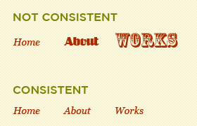
Successful interaction design boils down complexity by creating consistencyand predictability. For example, don’t make some links open in a new tab while others redirect the user. Likewise, don’t use a lightbox for some images while others open in a new tab.
Consistency creates predictability, which improves learnability.
consistentdesign The 5 pillars of interaction design
A common tactic for improving learnability is using UI patterns. Many sites and apps already use these patterns so the user is familiar (plus the pattern is consistent), and you’re still allowed plenty of creativity to customize the design elements for your site.
breadcrumbs web design navigation 1 520x189 The 5 pillars of interaction design
For example, breadcrumbs are a common web pattern for helping users navigate. It doesn’t matter what site you’re on, if you see breadcrumbs, you understand how they work. This familiarity lends itself to a product’s learnability. When products are learnable, it encourages people to use those products, which naturally improves usability.

5. Feedback & Response Time

Feedback is the heart of interaction. Since every interaction is a conversation between your user and product, your product better be friendly, interesting, and helpful.
designprinciples 520x208 The 5 pillars of interaction design
Whether an elaborate animation, a beautiful micro-interaction, or a simplebeep, your product must communicate if the task was or was not accomplished (and what to do next).
In the below example from Hootsuite, the owl simply “goes to sleep” after a long period of user inactivity, which makes sense since the app pulls in data from Twitter (and doesn’t want to overload the API). The feedback is intelligent and fun, and actually turns a possibly negative experience (stopping updates) into a positive one.
hootsuite The 5 pillars of interaction design
Another key factor in feedback is response time. The best response times areas immediate as possible. Imagine how infuriating it would be if you were playing a guitar, and every note came seconds after strumming.

5-Step Process for Improving Interactions

Now that you know the fundamentals, we’ll describe a process we’ve found helpful to nailing the details.
IXDA Columbus 520x388 The 5 pillars of interaction design
Source: IXDA Columbus
As notable interaction designer Stephen P. Anderson advises, it can be eye-opening to have someone pretend to be your interface while you interact with them as a user. You’ll be able to hear out loud any awkward responses from the interface, which will help you avoid creating robotic interactions that feel inhumane. Once you’re done with the role play, you can start scripting the narrative and restructuring interaction.
Here’s the process:
Roleplay the interaction — Grab two people, one to act as the interface and the other to take notes. Make a browser window prop to be held by the interface person and show the interface on a projector. Then, start a dialog with you as the user explaining their goal, and the “interface” limiting their responses only to labels, menus, and anything else on the UI. Check out thisvideo and transcript to see how it plays out.
role play 600px 520x347 The 5 pillars of interaction design
Map out the narrative — Document each step of the experience, including tasks and emotions. As discussed in The Guide to UX Design Documentation, this can be as simple as a few user scenarios or as complex as a 4-stage experience map.
RailEurope CXMap FINAL.001 520x390 The 5 pillars of interaction design
Simplify the steps — Users sometimes have goals that require many steps (buying a car online, booking airline tickets). As recommended in The Guide to Prototyping, your interface must be able to separate a complex goal into simple steps (like asking for a destination, then a departure/arrival date, etc). For example, Virgin America’s stepped form design make the booking process feel much easier than it is.
 simplifysteps 520x332 The 5 pillars of interaction design
Limit user choices — This is probably the hardest step, but you must minimize the actions available to users. Always ask yourself if all the choices are critical for that moment in time. If not, separate it for another conversation.
Pay attention to micromoments — A micromoment is when a person might hesitate, advance, or stop when engaging with interfaces. If you look back to the role-playing exercise, you’ll remember the moments of apprehension. To clarify the conversation, take advantage of microcopy and UI patterns like contextual actions and selection-dependent inputs (which we discuss in Web UI Patterns 2014).
Just like a magician’s trick will fail if the details are off, just one bad interaction can ruin the entire user experience. The process we described above will help you approach interaction design as a conversation rather than just a way of animating interfaces.
If you’d like more inspiration and examples of good interaction design, this Quora thread includes great sources ranging from films to websites likeCore77 and PatternTap.

Closing

Interaction design isn’t about how interfaces behave, it’s about adapting technology based on how people behave. You must know your target users like and expect, functionally and emotionally. Based on the technological constraints, you must then design the product for desirability.
The best interaction design is barely there: your product responds promptly, doesn’t require much thought, and works like a good magic trick.

Comparing Apple to Hitler for its closed and restrictive system, LeTV boss makes a pitch for his Android phones

Chinese Android smartphone maker LETV equates Apple to Hitler


Google’s Android operating system for smartphones and tablets started out as a viable alternative to the expensive, restrictive and closed iOS operating system from Apple. Over the years, Android has gained immense popularity and users with around 2 billion + smartphones and tablets running on it.
However a Chinese businessman and owner of Android smartphone manufacturing unit, LeTV did something very unnatural. He put up a ad campaign equating Apple to Hitler.
The ad which is meant to take a dig at restrictive and closeted Apple’s iOS operating system.
LeTV’s CEO, Jia Yueting posted an image that showed Hitler raising his hand on one end and a few kids on the other end. Apple’s logo is on Hitler’s dress, which symbolizes the comparison in a clear way.
Not that LeTV is popular, in fact it is yet to release any smartphone under its brand name. The ad campaign seems to an effort to rouse up sentiments and be in spotlight for a few days.
We surmise that this is not a very good campaign. Taking on world’s most innovative company when you dont have any product to offer is just not done.
Introducing Vaniday

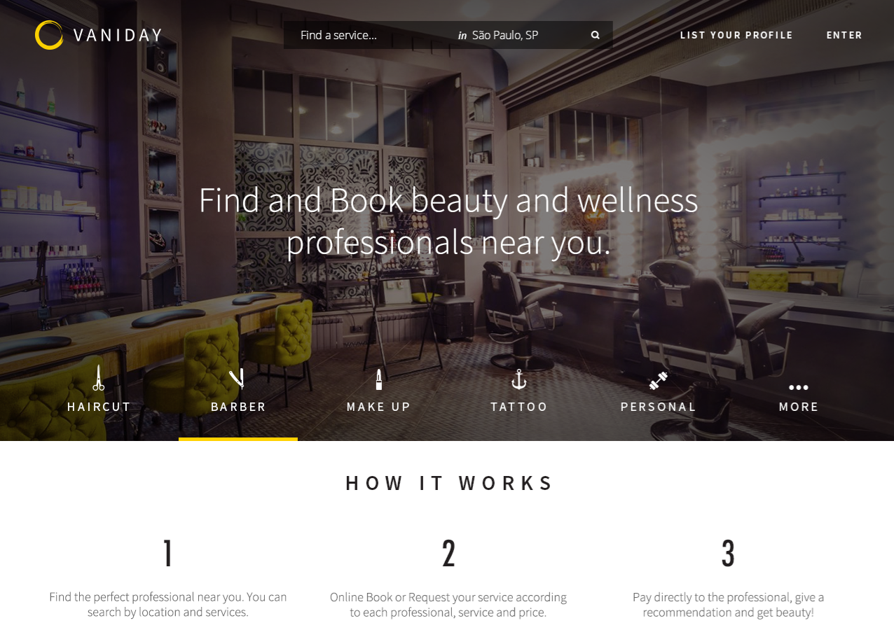
German startup builder Rocket Internet is unveiling Vaniday, a beauty and wellness services marketplace. It is launching in Brazil today, with plans for fast international expansion.
Vaniday will showcase personal services providers such as hairdressers, makeup and nail artists, beauticians, tattoo artists and massage therapists. The marketplace will first be available as a website, with iOS and Android apps announced as “coming soon.”
Its search engine lets clients filter professionals by service, price, location, or ratings, while service providers can manage their own listing. Yet, Vaniday isn’t just a directory of providers; it also lets users book services right from its platform.
In addition, some services might be provided at home. “At Vaniday, our ambition is to connect anyone with the beauty and wellness services they need, whenever and wherever our customers demand it – whether at the hair salon, their home or their office,” explains Vaniday CEO and Founder Maxime Legardez.
vaniday 01 home Edited Why Rocket Internets new beauty marketplace Vaniday is launching first in Brazil

 Vaniday’s roots

Vaniday Founder Maxime Legardez 220x328 Why Rocket Internets new beauty marketplace Vaniday is launching first in Brazil
Legardez is a French ex-pat who traded finance and private equity for the world of startup building. His CV includes a stint at Project A‘s tires marketplace Tirendo, followed by 2 years running online eyewear store GlassesOnline in Southeast Asia.
His latest role was already within Rocket’s portfolio, where he was leading Russian and Brazilian operations for food delivery heavyweight Foodpanda, better known in Latin America under its ‘Hellofood’ brand.
As Legardez told TNW, Vaniday was born from an observation he made while living in São Paulo: “Why can you easily book a taxi or order food, and yet you can’t do the same for beauty services?”

A convincing market opportunity

When he took his idea to his bosses at Rocket Internet, Legardez did not only bring his observations, but also some market research that allegedly persuaded them to pursue this opportunity.
On one hand, Brazil has been the third largest beauty and personal care market in the world, after the US and Japan, with $42 billion in combined sales in 2012. On the other hand, most of  the country’s quarter million registered beauty salons have no online presence or a limited one, and certainly don’t offer online booking.
In addition to seeing demand for a marketplace on both sides, Rocket Internet made sure as usual that this business model had been tested abroad, most notably by US-based Styleseat. The offer outside of the US remained more fragmented, which convinced Rocket to go ahead and create Vaniday.

Building companies

logo RGB 220x43 Why Rocket Internets new beauty marketplace Vaniday is launching first in BrazilIt is no secret that Rocket Internet made its fortune from a single formula: “We identify and build proven Internet business models and transfer them to new, underserved or untapped markets, where we seek to scale them into market leading online companies,” its website details.
This approach has worked well for Rocket; in October 2014, it became a publicly traded company on the Frankfurt Stock Exchange, and it now employs more than 25,000 people across its global portfolio.
Brazil in particular has been an important market for Rocket Internet, which is present in the country through nine companies: bus booking platform ClickBus, deals site CupoNation, fashion retailer Dafiti (see our story), taxi startup EasyTaxi, cleaning services marketplace Helpling,home24‘s furniture e-store Mobly, ridesharing newcomer Tripda, home design portal Westwing and Airbnb copycat Wimdu.
logo helpling Why Rocket Internets new beauty marketplace Vaniday is launching first in BrazilThese ventures follow a similarly aggressive strategy that relies on quick expansion and even faster international rollout, often through acquisitions. This approach is backed by multi-million financing rounds, the latest deal in date being Helpling’s €43 million Series B (around $47 million USD).

What’s next

At least one of Rocket Internet companies was born in Brazil before expanding into many other countries: EasyTaxi, which is present on three continents (despite some recent setbacks in Asia). Still, it is interesting to see that Vaniday will first start in Brazil, considering the economic context.
As a matter of fact, the country’s economy only grew by 0.1% in 2014. Perhaps more importantly for Vaniday, this climate will also affect the beauty sector; according to Euromonitor, “economic slowdown, inflation and market saturation in various categories will begin to impact the industry more strongly in the near future.”
However, Euromonitor notes that “the forecast for beauty and personal care [in Brazil] is still optimistic for the coming years,” with expectations for moderately positive growth, which may explain Rocket Internet’s bet on Brazil as a testing ground.
One thing is for sure, it will be interesting to see whether Vaniday becomes as successful as some other Rocket-backed brands, and into which countries decides to expand next.
Image credit: Rocket Internet

Digital-Marketing-Audit

Legendary historian and documentarian James Burke famously said, “you can only know where you’re going if you know where you’ve been.” He was referring to history, but this quote just as easily applies to marketing. Many marketers that are eager to improve blindly embark on a marketing plan without understanding their current state of affairs.
MarketingAudit 520x325 5 steps to audit your digital marketing strategy for 2015

Creating a marketing plan without performing a proper digital marketing audit can cause you to invest in unnecessary initiatives and to overlook gaps in your current strategy. Many marketers forgo performing an in-depth audit because it can be an intimidating and time-consuming process.
Being so closely involved with your marketing on a daily basis often makes it hard to have an objective idea of where you stand. This article will attempt to outline a plan to help you objectively examine your online presence across multiple platforms and help you optimize your efforts using the latest tactics and best practices.

Big Picture Questions

Before attempting to address specific concerns or areas for improvement it is necessary to take a zoomed out view of your marketing strategy. Focusing on incremental improvements or compliance with best practices will be useless if your overall marketing plan lacks focus or is pointing your organization in the wrong direction.
The questions to be asked in this phase of the marketing audit might seem simplistic, but careful consideration may reveal truths about your business and/or marketing strategy that may have been previously hidden. These questions include:
  • What is the current state of our business?
  • How is our marketing strategy affecting our business?
  • What business goals are we expecting from a marketing overhaul?
  • What would success look like?
  • How would marketing contribute to that success?
In order to set yourself up for success, you need to define it; and measuring your efforts in detail requires you to clearly define the criteria for success. Understanding the current state of affairs is crucial because the value of all future efforts will be judged according to this baseline.
The next step towards articulating the expectations of your marketing strategy is to have an idea of how marketing will affect your bottom line. At the end of the day, this is the only function of marketing strategy. Understanding how marketing will ideally interface with the business will be necessary for evaluating your current strategy, as well as plotting a course for the future.

SWOT Analysis

Any marketing 101 class will certainly have highlighted this classic evaluation tool. SWOT stands for strengths, weaknesses, opportunities, and threats, and constitutes a simple yet effective way of understanding your business from both an internal and external standpoint.
Once you’ve defined your criteria for success and how your marketing strategy might help you advance these goals, then you can evaluate each component of your organization’s marketing in regards to one of these four categories.

SWOTChart 5 steps to audit your digital marketing strategy for 2015
Strengths and weaknesses: These represent the internal state of affairs within your current marketing strategy. This evaluation might consider the current capabilities or competencies of your marketing team, the quality of communication amongst this team, or the accuracy and volume of marketing data you are collecting.
Opportunities and threats: These constitute external factors that might affect your overall marketing strategy. This may involve analyzing market research and determining if the channels you are currently using are trending downward in traffic. For a company well established on MySpace in 2005, Facebook’s ascendance may have been a huge threat. Additional factors to look at are where your competition is placing their efforts and if you can outdo them or find room in that space.
While performing a SWOT analysis, always keep in mind the business insights from the previous step. All these terms are relative judgments and they are based on the ability of your company (both internally and externally) to employ marketing strategies to meet business goals.
Once a SWOT analysis is complete for the marketing strategy as a whole, the next step will be to perform a more granular analysis of the various components of your digital marketing mix.

Search Engine Optimization Audit

Search engines lie at the heart of any digital marketing strategy because they constitute one of the main ways that people discover products and services online. According to a recent report, Fleishman-Hillard found that 89 percent of consumers turned to Google, Bing, or another search engine to inform their purchasing decisions.
SEOAudit 5 steps to audit your digital marketing strategy for 2015
Optimizing a website for search is an intricate, in-depth, and lengthy process. This makes any current efforts particularly difficult to audit. However, there are a few key steps for evaluating where your SEO strategy stands and how certain factors that affect search ranking might be improved.
Competitive analysis: The first step to determining the effectiveness of your SEO is to get an idea where your strengths lie. Take stock of the content, keywords, and links currently present on your site and see which of these are working for your rankings. Prioritize those that work and pursue building them out further, while abandoning areas that are not returning as well.
Technical issues: The next step in the auditing process is to determine if there are any weaknesses stemming from flaws in your site’s programming or design. Are there links that lead to nowhere? Content orphaned without links back? Poorly written or outdated content? Identify and remedy any problems you encounter.
On-Page Optimization: Once you’ve identified strategies that work and fixed any glaring errors on your website, now it is time to optimize this content. Here is where investigation of best practices will be crucial. Prime your site to rank well by properly using title tags, meta-data, and keywords.
Link building: After fully optimizing your site and deciding on content that works, employ a link-building strategy to help seize any opportunities that may be present for your site. Seek write-ups on other relevant, well-trafficked pages, and/or produce content on-site that you know your audience will share.

Social Media Marketing Audit

While search may be the primary way people hunt for specific information about products, social media constitutes the main way that people form an impression about a brand or organization. In addition, social media has begun to play a role in how search engines rank results.
SocialAudit 5 steps to audit your digital marketing strategy for 2015
However, many brands do not take social media as seriously as they should. Many brands have social accounts that are languishing and forgotten. Some have accounts on different platforms that look like they belong to different brands. Still others have no clearly defined schedule or goals for their social presence. Brands who are guilty of any of the following are in need of a social media reality check. A social audit will address all of these issues and more.
Engagement evaluation: First, take stock of your current social media efforts across channels to determine which of your posts report the highest levels of engagement. This data will show which types of posts appeal to your target audience and point to where your current social media strengths lie.
Profile standardization: The next step is to determine where your social media presence might be lacking, non-existent, or inconsistent with your core messaging. This will also include taking stock of your current resources and abilities to determine how many channels your team is capable of tackling competently.
Best practices and trends: Once you have decided which types of posts work and what channels you will focus your efforts on, research industry trends and best practices for these channels thoroughly. Focus on compiling a social media checklist that can be summarized and shared across your entire team.
Schedule creation: After performing a broad analysis, identifying key channels, and determining best practices, collaborate with your social media team on incorporating the findings from the audit into a comprehensive and detailed social calendar. Each channel should have its own schedule, but they should all interrelate to each other.

Content Marketing Audit

If social and search constitute the current marketing standard, content marketing represents where these two distinct channels come together and where the current trends for digital marketing as a whole are pointing. Publishing high-quality content can dramatically enhance your SEO efforts and having quality content to post is all but necessary for finding success on social media.
ContentAudit 5 steps to audit your digital marketing strategy for 2015
It is critical to audit your content marketing to ensure you’re focused on the right goals from the start. Many look for shortcuts to success with content, which can be avoided by understanding how your content performs today and what you want to achieve in the future.
“Don’t look for loopholes to exploit,” said Jesse Noyes, senior marketing director at Kapost.
“Instead, focus on creating quality content and doing it consistently. So many businesses try to game search engines and social networks. They look for some weakness in the algorithm that will get their content seen more often. And, sometimes, this works — for a little a while. But eventually the Google’s and Facebook’s of the world figure it out, improve it, and suddenly that same content is buried or penalized,” he added.
Many organizations either don’t have a clear content strategy, or do not account for the various opportunities for synergy it presents as Noyes pointed out. A content audit will help brands ensure that their current content efforts align with their audience’s expectation and current best practices and that their future efforts take full advantage of content marketing’s potential.
Content consolidation: Many brands might be producing content, but these content efforts are often scattershot. Locate all of the content your brand has produced across channels and decide where this content may be best consolidated.
Audience evaluation: To inform the decision of where to have your content live, do an analysis of the target audience for this content. What demographics does your current content appeal to? Where do they spend their time online? What other kinds of content might they be most receptive to?
Content strategy: Once you have decided which audience and channels to target, work closely with your content team to develop a content strategy and schedule to best capture this audience’s attention. Determine not only where your content will live, but also which types of content would be most appropriate for this channel, and what level of frequency your team is capable of producing.
Content optimization: After creating a robust content schedule the final step is to research multiple ways to optimize this content for each part of the sales funnel (SEO and social distribution as well as conversion and lead generation). Create a comprehensive set of guidelines for your content team moving forward and make sure your existing content is edited to fit these guidelines.
While the prospect of a comprehensive marketing audit might be daunting, the only way you can hope to improve your marketing is to have a solid idea of where you stand. By following these guidelines you should be able to investigate your current marketing efforts methodically and comprehensively and do so in a way that simultaneously informs your future marketing efforts.
How does your organization regularly analyze the state of your marketing efforts and when was the last time you performed an audit?Share your thoughts in the comments below.

Does Your Digital Marketing Strategy Need An Update?

Make it your goal to bring your out-dated digital marketing strategies up-to-date. If you don’t have the time or personnel to deal with auditing your digital marketing strategy on your own, consider hiring a marketing partner with over a decade of experience building high-performing digital marketing strategies that will fulfill your business goals for the year ahead.
background